
Skip to content
Astha Dhami
Information architectureUX researchWCAG guidelinesDeveloper handoffs

TravelersBuddy

How might we create a seamless, personalized trip-planning experience that reduces user stress?

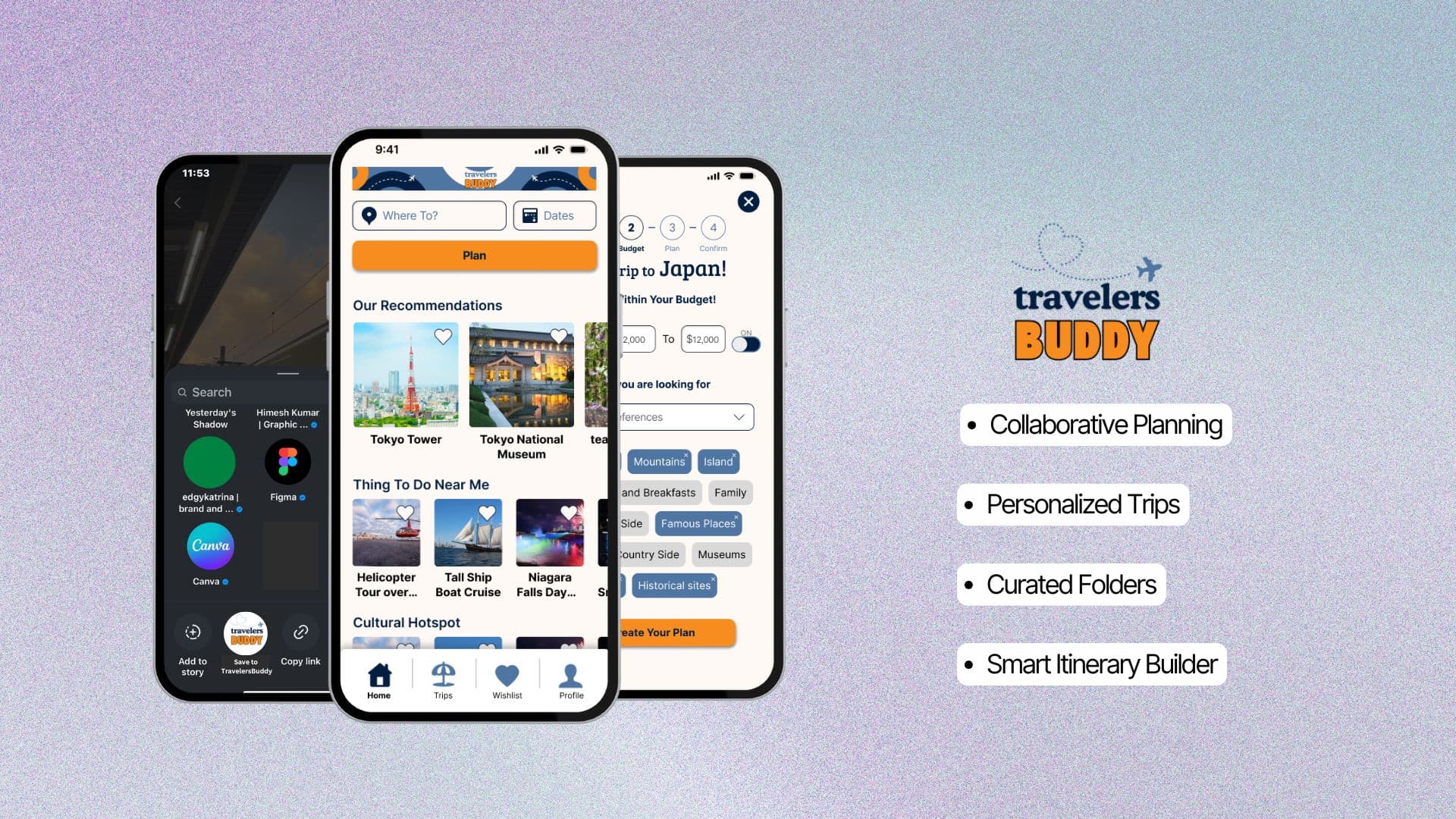
TravelersBuddy app screens showing trip planning, wishlist recommendations, and budget setup, alongside the TravelersBuddy logo
TravelersBuddy app screens and product logo.
Preview Final Prototype ↗
Timeline
3 months
My Role
Competitive analysis, wireframing, and usability testing.
Team
4 other UX design students
Tools
Figma, Miro

Challenge

As a team of UX design students who love to travel, we kept running into the same problem ourselves: flight comparisons, itinerary spreadsheets, and budget tracking scattered across a handful of disconnected apps, with enough friction to make us put off booking trips we had already decided to take. This student project explores what a more thoughtful planning experience could look like.
My Role

I conducted competitive analysis and user interviews, crafted low- and mid-fidelity wireframes, carried out usability testing, and iterated our solution design to refine the experience, working alongside four other UX design students and presenting our work to industry reviewers in under four minutes.

The Solution

TravelersBuddy is a collaborative travel-planning app that auto-organizes saved ideas from social media into curated folders, pulls relevant wishlist items into generated itineraries, and lets users share plans with travel companions, with personalized suggestions keeping the experience organized and tailored to each traveler.

01

Discover

Refine the problem space, determine research priorities, and prepare a research plan.

02

Define

Conduct user research, analyze results, and identify the problem.

03

Design

Ideate and prioritize solutions, create user flows and wireframes, test interactive prototypes with users.

04

Deliver

Iterate on designs, apply visual polish, present your final output.

Discovery

But what makes travel so stressful?

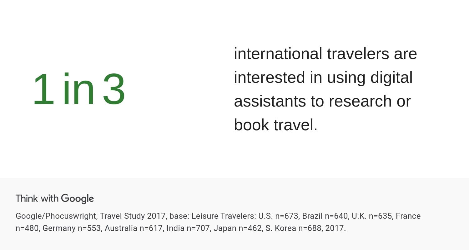
Open source: Think with Google, Future of Travel report, Google/Phocuswright Travel Study 2017
Statistic from Think with Google: 1 in 3 international travelers are interested in using digital assistants to research or book travel

TripIt, Google Travel, Kayak, and TripAdvisor gave us a view into existing solutions and surfaced three recurring gaps: fragmented experiences, overwhelming information, and a lack of personalization. Read the full competitive analysis ↗

Four existing tools analyzed: Kayak, TripIt, Google Travel, and TripAdvisor.
10 user interviews: 9 of 10 valued staying within budget, 6 of 10 relied on social media to plan.

Through 10 interviews, we unearthed critical insights. Travelers wanted:

  • Easy itinerary sharing
  • Cost-effective planning
  • Tools that adapted to their preferences
Our research highlighted the following problems in existing solutions
Three core problem areas: user experience complexity, collaboration limitations, and personalization limitations.

View the annotated affinity diagram ↗

I love being on vacation, but trip planning? That's a job I'd outsource in a heartbeat!
Miranda

So, who is Miranda?

Persona: Miranda, 29, an IT Manager in Toronto who travels 4-5 times a year and wants her planning tools to keep up.
Before the trip: Miranda saves ideas across scattered apps and loses track of what she found.
During the trip: Miranda struggles to coordinate plans with friends and recall saved details.

Define

How might we create a seamless, personalized trip-planning experience that reduces user stress?

We ran a "crazy 8s" exercise, 5-minute intervals of 8 rapid sketches each, to push past the ideas we had been circling since the research phase and get them onto paper.

We transferred those ideas to stickies, then prioritized them into a final feature list.

Crazy 8s sketches and feature-prioritization notes from the ideation session.
Prioritized features for this project
  • Trip ideas saved from social media would be automatically organized into curated folders in the wishlist.
  • Users could share the trip plan with travel buddies for better collaboration.
  • When planning a trip to a certain place, the app would automatically pull applicable wishlist items into itineraries, eliminating the need to cross-reference.
  • The app would generate a personalized itinerary using user preferences.

Design

Design

Paper wireframes for the trip overview, new-trip flow, and itinerary editing screens.

We identified our key user screens (wishlist, profile, explore) and each sketched at least two options before reconvening to compare approaches.

We combined the strongest parts of each into one direction, guided by what we had learned about our users.

Next, we built lo-fi wireframes into a prototype for user testing, guided by a usability script ↗ and the task we asked participants to complete.

Observing how participants worked through the task surfaced insights I would not have gotten from the script alone.

A 10-step UI sketch storyboard testing the create-a-new-trip and edit-recommendation flows.

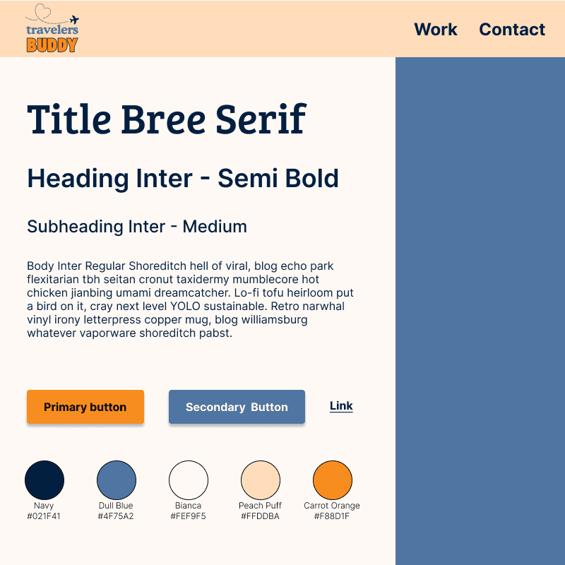
The brand palette is WCAG 2.0 AA compliant, using vibrant orange for key interaction points like the "Plan Trip" button and a lighter background to keep the rest of the interface calm.

Typography stays clean and legible throughout, so users can move through the planning flow without friction.

TravelersBuddy brand style guide showing the Navy, Dull Blue, Bianca, Peach Puff, and Carrot Orange color palette, typography, and button styles

Deliver

Usability testing shaped every iteration of the design.

Trip Plan Edit Page iterations: added breadcrumbs, renamed the primary action to 'Plan,' and enabled card reordering.
Homepage and Wishlist page iterations: refreshed recommendation layout and simplified wishlist structure.
What would differentiate this concept from other apps on the market?

Curated folders had been our headline feature, but it was not a strong enough differentiator on its own, so I took on finding what would actually set the app apart.

User interviews surfaced a clear pattern: 6 of 10 participants said social media directly influenced their travel decisions, but they struggled to save and revisit ideas they found on Instagram and TikTok. Once liked, a post got lost in the feed and was hard to find again when it came time to plan.

The problem: Miranda saves ideas across scattered apps and can't find them again when it's time to plan.

That gap became the opportunity we designed around: a way for users to save, organize, and revisit travel inspiration directly from social media, so nothing gets lost in the feed.

The proposed solution: saving an idea straight to TravelersBuddy from Instagram would keep every trip idea in one organized place.

Learnings

Learnings

Falling in Love with User Research

Conducting interviews and synthesizing what we heard clarified how much I enjoy understanding people's needs, frustrations, and behaviors. It became the part of the process I looked forward to most.

Crazy Ideas Can Lead to Big Solutions

The crazy 8s exercise showed me I could generate bold, unconventional solutions in just four minutes under real time pressure, which changed how much I trust rapid, low-fidelity ideation.

Presenting with Impact

Being recognized as the strongest presenter by our TA confirmed that I can communicate a design rationale clearly, even under a tight deadline.

A UX Journey Worth Pursuing

Working through the full process, from discovery to final presentation, reinforced my decision to move from software development into UX. It confirmed the direction I am building toward.