
Skip to content
Astha Dhami
Internship projectUX designproduct ownership

A clearer path through data sync

How I made a complex enterprise data synchronization workflow easier to understand, configure, and recover from.

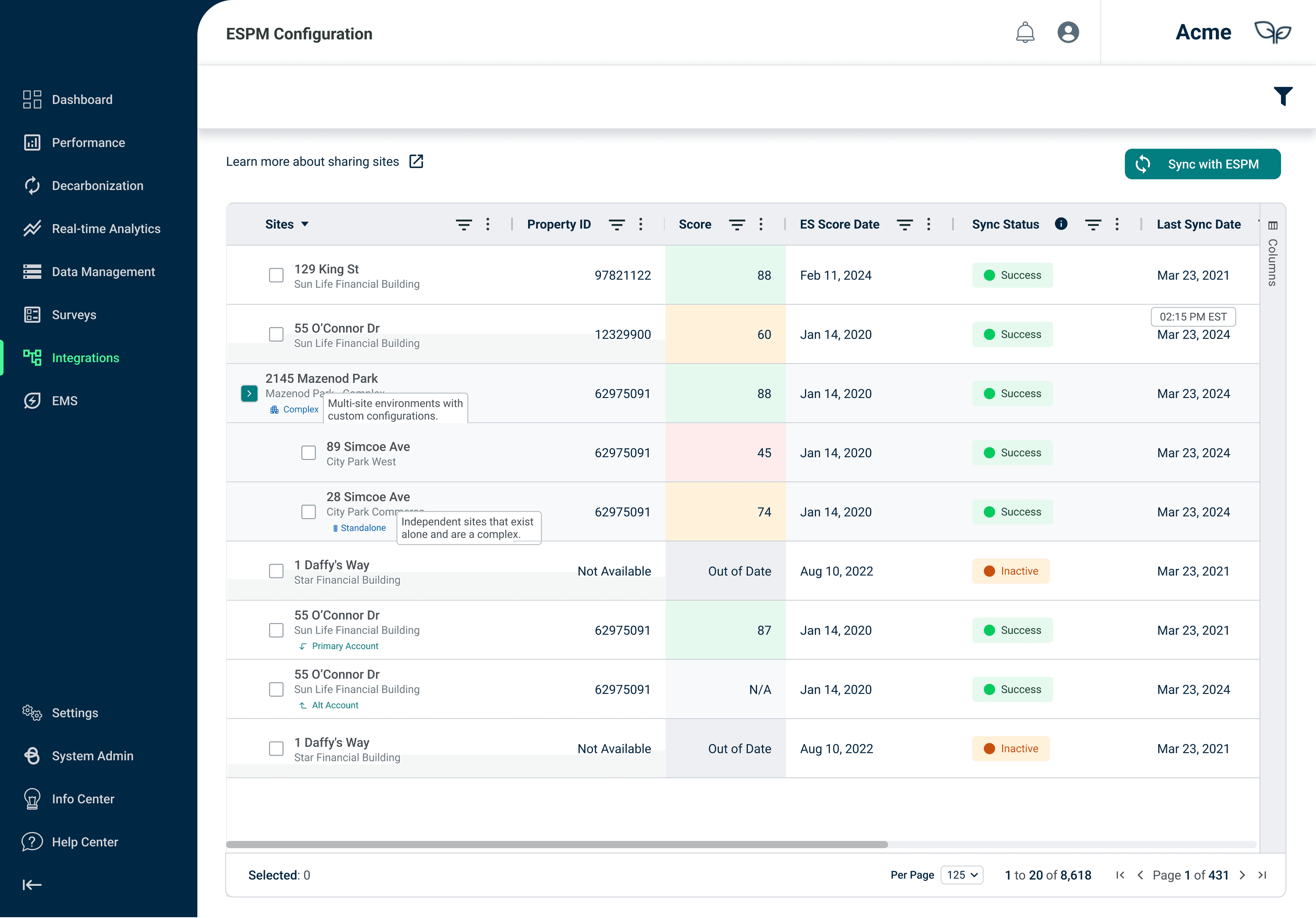
ESPM landing page, shown with sample data for this NDA-safe overview
ESPM landing page preview, shown with sample data for this NDA-safe overview.
View in-depth case studyA password is required to view this case study
Role
UX Design & PO Intern
Scope
Research, interaction design, and usability testing
Timeline
8-month internship
Disclosure
Details generalized to respect confidentiality

2–3 hours → under 15 minutes

Setup time

At a glance

Connection and status visibility

Traceable

Failure feedback with timing context

The public version focuses on the design reasoning and outcome, while omitting proprietary screens, internal identifiers, and implementation details.

Challenge

A simple sync action carried too much hidden complexity.

Sustainability teams were reconciling information between an internal platform and an external benchmarking service. Before they could act, they had to understand ownership, direction, permissions, status, and what to do when something failed.

Before

The starting point

  • Important context was distributed across tables, labels, and deeper configuration views.
  • Status was technically present but slow to scan and difficult to interpret at a glance.
  • A failed connection did not explain what happened or when it happened.

After

The design opportunity

  • Surface connection state before users drill into configuration.
  • Use plain language and visual cues to support quick comparison.
  • Keep recovery guidance close to the affected status.

Approach

I used research and feasibility work to find the smallest changes with the biggest effect.

I combined competitive analysis, technical feasibility assessment, conversations with service users, wireframing, prototyping, and usability testing. Each activity answered a different question: what do people expect to see first, which terms create hesitation, and which feedback helps them recover without outside support?

Research

Start with the questions behind the workflow

I mapped the moments where people needed orientation, interpretation, or reassurance before taking action.

Feasibility

Design within the system's reality

API and workflow constraints shaped what could be surfaced immediately and what belonged one layer deeper.

Validation

Test the language, not just the layout

Usability testing exposed small wording and feedback gaps that made the workflow feel less trustworthy than it was.

Design Direction

The interface needed to answer three questions before asking users to configure anything.

01 / Connection

What is connected?

Make the linked account, ownership, and latest activity visible before a user opens a detail view.

02 / Direction

Which way is data moving?

Use direct language and clear status cues so the relationship between systems is understandable at a glance.

03 / Recovery

What happens when something fails?

Pair a visible failure state with plain-language context and timing so the next step is easier to find.

Outcome

The result was a workflow that made system complexity easier to read.

The final direction brought connection status, data direction, and recovery feedback into one clearer mental model. It gave teams a faster path through setup while making the system's boundaries and failure states more legible.

Orient first

Users can understand the state of the relationship before opening configuration.

Scan faster

Visual status cues reduce the need to read every row to find what needs attention.

Recover with context

A failure carries enough explanation and timing to support the next conversation or action.

Reflection

Good enterprise UX makes complexity legible without making it feel heavy.

Language is part of the product

A technically accurate label can still fail if it does not match the user's mental model. Naming deserves the same care as the interaction around it.

Feedback should carry a next step

A status becomes more useful when it explains what changed, when it changed, and what the person can do next.

Constraints can sharpen the work

Working within existing systems pushed me to prioritize the moments that most improved confidence instead of adding complexity for its own sake.