Skip to content
Astha Dhami
Information architectureUX researchWCAG

OurGreenway

A 10-week research-led IA redesign for a Toronto sustainability nonprofit, led as primary researcher and designer within a four-person team.

Final research hub design and key prototype validation results.
Role
Primary researcher and designer
Duration
10 weeks
Team
4-person UX team with the CEO, Treasurer, and Operations Coordinator
Methods
6 activities: competitive analysis, content audit, desk research, 3 stakeholder interviews, open card sort, and usability testing
Tools
Figma, ScreamingFrog, UXtweak, FigJam
Deliverables
Redesigned IA, hi-fi prototype, WCAG remediation and developer handoff

Impact

~30% → 100%

Average task success across the three hardest tasks

3:40 → 0:38

Event registration time

2.3/5 → 4.6/5

Donation trust rating

Validation results from prototype testing against the same tasks that failed on the live site.

Challenge

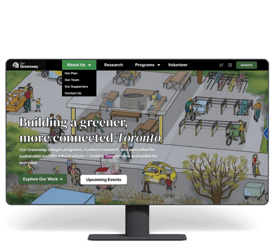
OurGreenway had grown citywide. Its website still told a neighborhood-sized story. Programs were buried, Research had no home, and donations opened an unexplained York University page. People weren't struggling to read the site, but there was friction.
My Role

I led the research strategy and IA redesign as the primary researcher and designer within a four-person team, working directly with OurGreenway's CEO, Treasurer, and Operations Coordinator. I ran six research activities, including the open card sort and independently recruited usability testing, and delivered the accessibility audit.

The Solution

  • Four task-based destinations
  • Hi-fi prototype
  • WCAG remediation and developer handoff

Problem

The content existed. The routes to it weren't intuitive.

IA wasn't very intuitive

More than ten reports and publications were buried inside Our Work, listed individually with no browsing controls, and the Publications link in the navbar was broken outright, a critical-severity finding in the content and accessibility audit.

The donation flow read as untrustworthy

The Donate button redirected to a York University page with no explanation. Two of six usability participants considered leaving at that point, and one did not finish the task.

When I go to the donation page, I get redirected to York University, and it makes me feel like it's a phishing website.
Usability participant
Research had no address

Stakeholders confirmed that research was a major part of the organization's work, but not all of it was being published. The existing structure, listing everything inside a single dropdown, wasn't built to show the full scope of that work. It had nowhere to live in the navigation, and nowhere for a visitor to look.

Research

Six methods, each answering a different question.

I ran each method because it could answer something the others could not: what existed, what was broken, what the organization could change, and where visitors still got stuck.

Competitive analysis

Benchmarked against Evergreen and WindReach, two Canadian nonprofits with comparable multi-program, multi-audience sites. Evergreen's top-level research hub and site-wide search became the clearest reference for consolidating OurGreenway's scattered content.

Content and accessibility audit

ScreamingFrog technical crawl plus manual WCAG 2.1 review. Nineteen issues surfaced across four priority levels: 3 critical, 4 high, 5 medium, 7 low, and shaped which fixes had to ship with the redesign.

Desk research

Full map of navigation hierarchy, click depth, and labeling consistency. Programs took two clicks to reach versus one for Contact, a concrete signal that a high-intent action was structurally buried.

Stakeholder interviews · 3

Teams calls with the Treasurer, Operations Coordinator, and CEO, run before writing a single recommendation. This is what reframed the donation redirect from a technical problem into an under-explained partnership.

Open card sort · 5 participants

Eighteen real content cards on UXtweak. The sort produced two clean, almost non-overlapping clusters, but participants could group the programs-and-research cluster without being able to name it.

Independent usability testing · 6 participants

Six participants were recruited independently to avoid familiarity bias and tested the redesigned prototype across the core journeys.

Insights

The research reframed the problem from content volume to missing addresses.

Card sort

The open card sort grouped 18 content cards across five participants on UXtweak, giving the team evidence for how people expected the site to be organized. Usability testing then showed Programs and Research represented different visitor intents and needed separate destinations.

Missing destination

Events never appeared as a category in the card sort, not because participants overlooked it, but because it wasn't represented as content to sort in the first place. That absence was itself the finding: Events didn't have an address, so no one could find one.

Constraint

Stakeholder interviews reframed the donation redirect from a technical problem into an under-explained partnership: York University wasn't a bug, it needed disclosure, not a costly infrastructure change.

Information Architecture

Two user clusters became four task-based destinations.

The original sitemap showed brand content in primary navigation, Research and Programs sharing ambiguous labels, and no clear Events destination.

Before

One overloaded internal structure

  • Our Work mixed active programs, research, and publications.
  • Join Us did not explain whether it meant events, volunteering, or donating.
  • Events had no address and Publications had a broken path.

After

Four destinations with distinct intent

  • Programs became a top-level route after usability testing exposed findability failures on the hardest tasks.
  • Research became a dedicated, browsable hub.
  • Events and Get Involved gave participation tasks a clear home.

The new IA combined what people grouped together with what their real tasks proved was missing.

The card sort established two strong mental clusters. Usability testing then showed where those clusters needed to split: active programs and published research served different intents, while Events needed to be introduced as a destination because the existing content model had omitted it entirely.

RAW CARD SORT OUTPUT — BEFORE USABILITY TESTING SHOWED WHERE IT NEEDED TO SPLIT

Cluster A

Who we are

  • Our Plan
  • Our Team
  • Supporters
  • Contact

Cluster B

Programs, research, and impact

  • Cycling Without Age
  • Cargo-bike work
  • Greenway Effect
  • Dispatches

Accessibility Audit

Accessibility was part of the information architecture, not a final polish pass.

3

Critical issues

A broken Publications path, an unexplained donation redirect, and heading plus keyboard failures blocked critical journeys.

19

Total issues

A ScreamingFrog crawl plus manual WCAG 2.1 review surfaced issues across four priority levels: 3 critical, 4 high, 5 medium, 7 low.

16

Prioritized for handoff

After the 3 critical issues were addressed in the final design, the remaining findings were handed to the development team by severity.

The audit translated critical-path failures into specific design and development actions.

Testing

I tested the redesign against the same tasks that failed on the live site.

01

Baseline on the live site

Six participants recruited independently to avoid familiarity bias tested the existing experience and the redesigned prototype across the core journeys.

02

Success criteria before design

I set targets for findability, donation trust, time to core content, and resolution of all three critical WCAG findings before moving into execution.

03

Prototype validation

The hi-fi prototype was evaluated against the three hardest tasks, including event registration, with task success, completion time, and donation trust as success measures.

04

Evidence-led handoff

The final direction paired measurable task improvements with a WCAG remediation document prioritized for the organization's development team.

Task performance

Average task success rose from ~30% to 100% across the three hardest tasks, event registration dropped from 3:40 to 0:38, and donation trust rose from 2.3/5 to 4.6/5.

Average task success

Across the three hardest tasks

Baseline

~30%

Redesign

100%

Baseline
Redesign

Event registration

Average completion time

Baseline

3:40

Redesign

0:38

Donation trust

Post-task self-reported rating

Baseline

2.3/5

Redesign

4.6/5

Baseline
Redesign

Outcome

The final direction made findability, trust, and credibility visible in the interface.

The footer became a second way in, not a dead end.

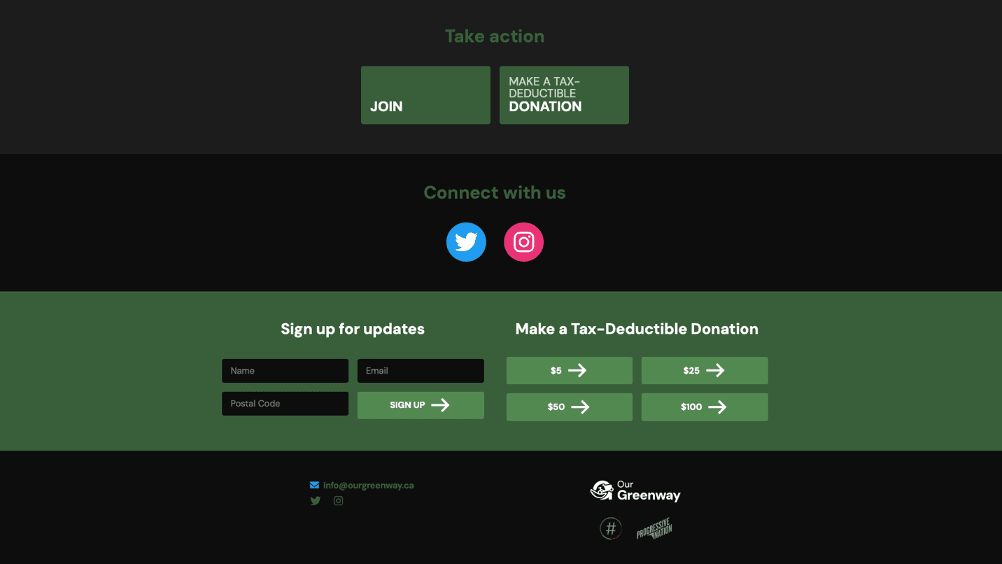
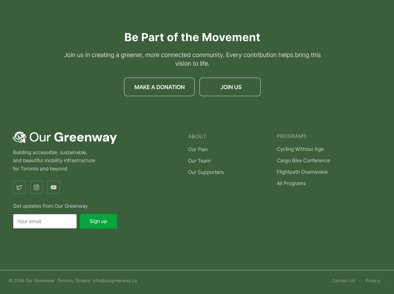
The original footer emphasized donation and sign-up actions but gave visitors no way back into the site once they reached the bottom of a page. The redesign mirrors the top-level structure, so Programs, Research, Events, and Get Involved stay reachable from anywhere, including for keyboard and screen-reader users who rely on the footer as a navigation layer.

Original OurGreenway footer with donation, social, and newsletter blocks but no secondary navigation

Before

Action-heavy footer

Visitors reached a collection of calls to action with no clear route back to programs, events, or research.

Redesigned OurGreenway footer with structured About and Programs navigation

After

Structured secondary navigation

A calmer hierarchy supports discovery, repeat navigation, and keyboard or screen-reader users who rely on footer links.

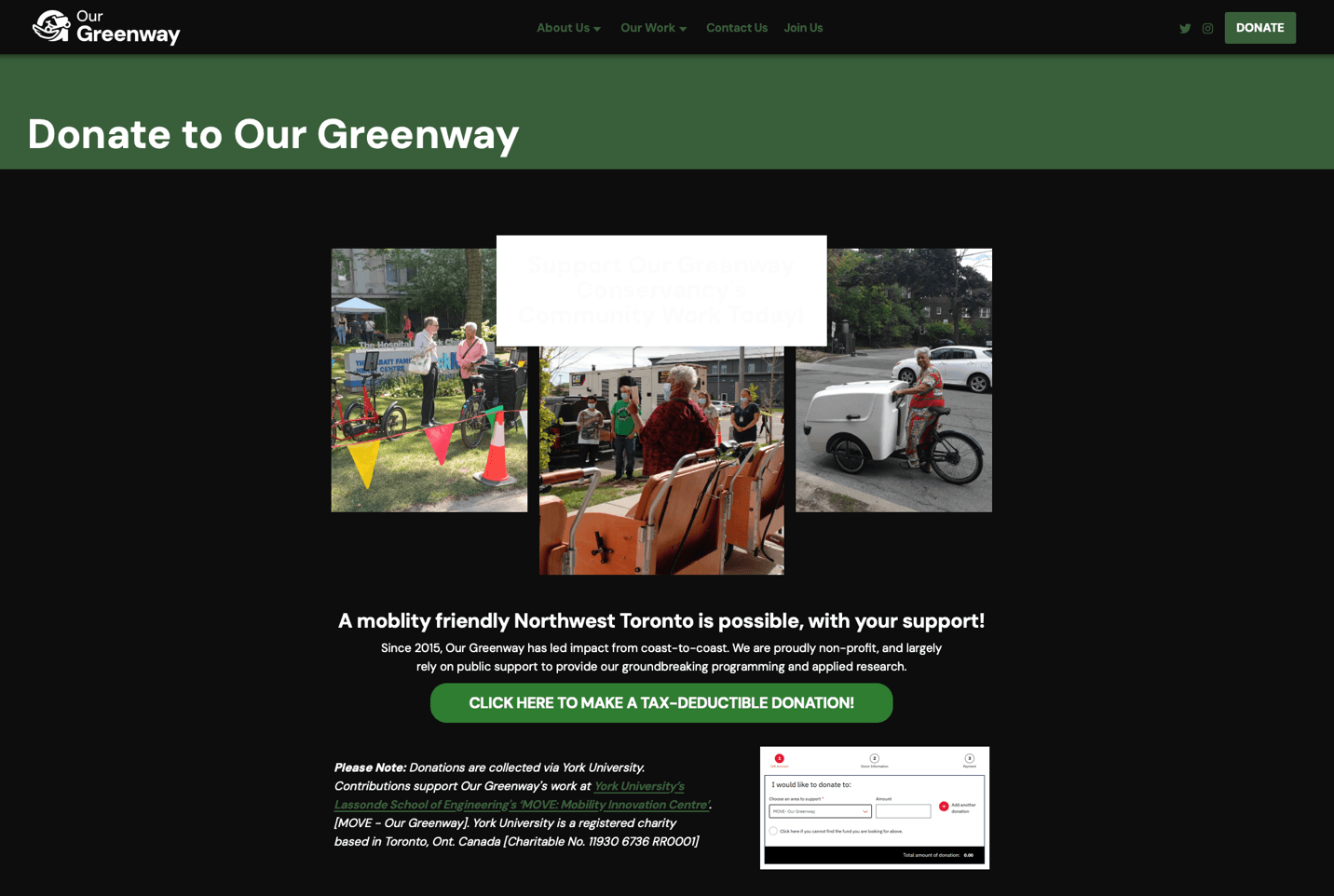
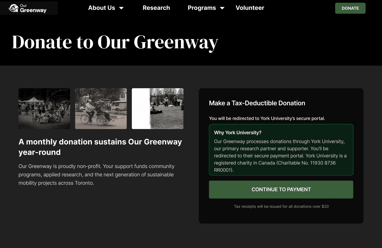
The donation redirect stopped feeling like a mistake.

Stakeholder interviews revealed that York University was not an accidental detour; it was the organization's research partner and donation processor. Instead of recommending a costly infrastructure change, I made the relationship and redirect explicit before people left the site.

Original OurGreenway donation page with an unexplained York University payment path

Before

Unexplained redirect

Participants landed on York University without enough context; one described the experience as potentially feeling like phishing.

Redesigned OurGreenway donation page explaining the York University relationship before payment

After

Trust before transition

The redesign makes that partnership explicit before anyone leaves the site, naming York University, explaining why the redirect happens, and confirming the payment portal is intentional.

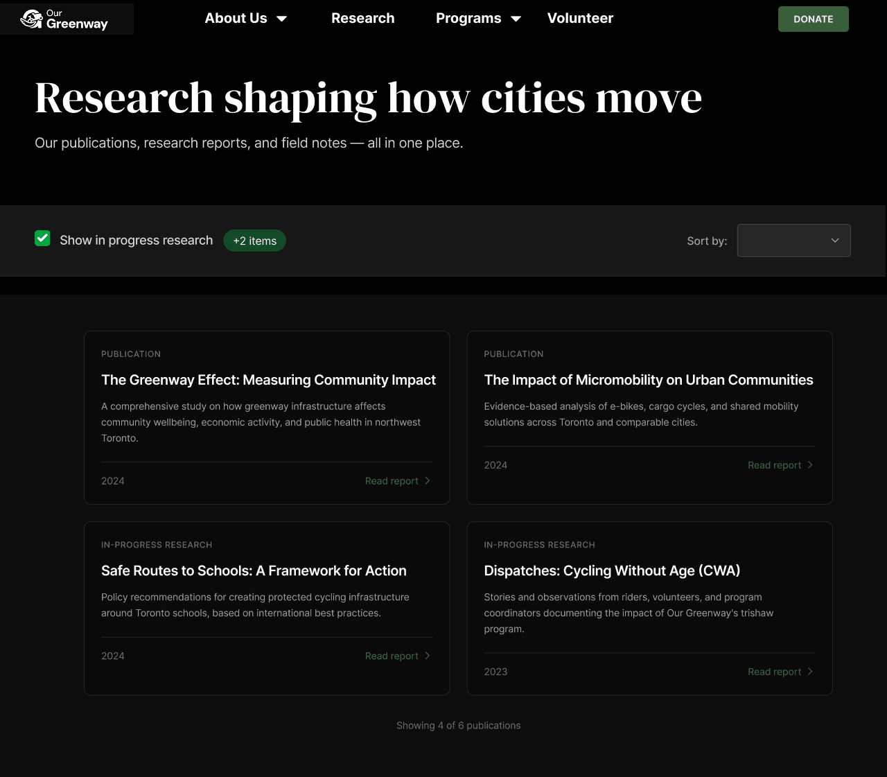
A decade of research finally had an address.

Publications had been mixed into Our Work, listed as individual titles, and hidden behind a broken link. The new Research destination brings reports together in one browsable hub with filtering and sorting, and a clear entry point from the main navigation.

Redesigned OurGreenway research hub with publication cards and browsing controls

After

Dedicated research hub

Reports, field notes, and in-progress research became visible in one browsable destination with filtering and sorting.

Reflection

This project changed how I think about research quality: the right participants matter as much as the right methods.

What I learned

People who already know a website are not the same as people who need to find their way around it. Recruiting independently, rather than through the client's contact list, protected the research question and exposed failures a familiar audience could easily have worked around.

What worked

Setting success criteria before design gave the team something concrete to aim for and gave validation an actual baseline to test against. Stakeholder interviews also kept the donation recommendation grounded in a real organizational constraint rather than an assumption about what the client would accept.

What accessibility actually required

During validation, our client arranged an interview with an 80-year-old community stakeholder, someone the accessibility audit existed to serve, not just describe. The video-call link that worked for every other participant didn't work for her: she needed a phone walkthrough just to join, and once in, struggled with basic controls like muting. Much of the session went to helping her connect rather than gathering insight. That reframed how I read the audit's own WCAG findings: accessibility gaps often aren't abstract compliance line items.

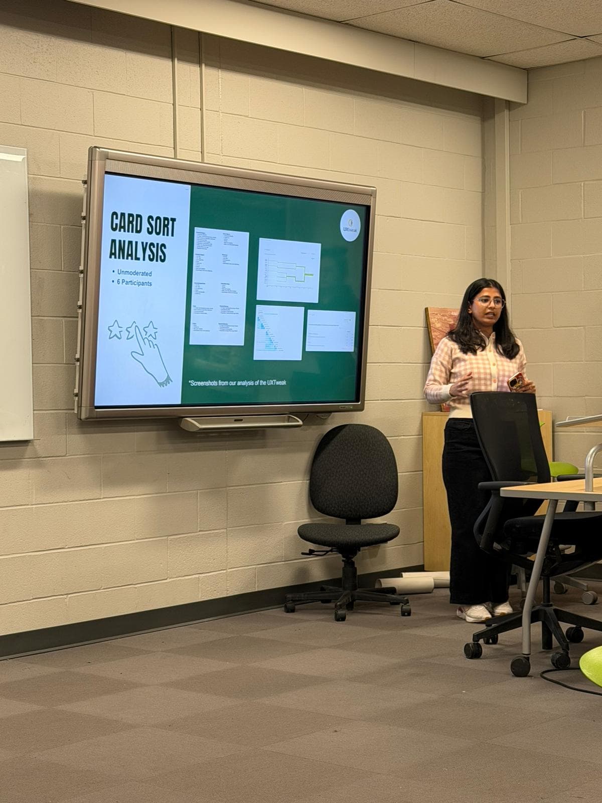
Astha presenting OurGreenway card sort analysis in a classroom
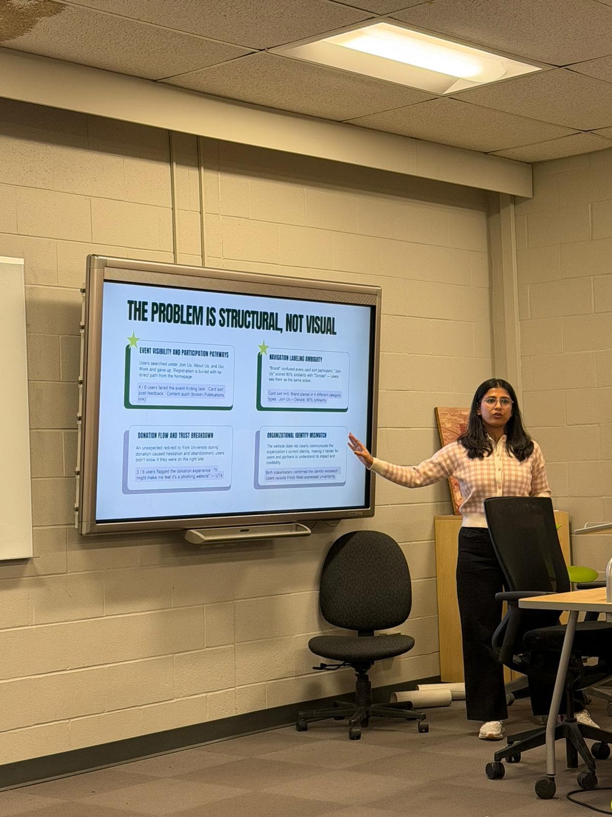
Astha presenting OurGreenway structural problem findings in a classroom
Presenting the final redesign and accessibility recommendations to the OurGreenway team and course cohort.

The takeaway I carried forward: good IA gives every important intention an address, then makes that address feel trustworthy enough to enter.